How visual communication is reshaping employee experience and why it matters more than ever
Design in 2026 feels different. Not just aesthetically different, but different in what people respond to and what feels credible. For teams shaping employee experience or internal communications, that shift has real implications. The work that’s landing now isn’t asking, “How do we make this impressive?” It’s asking, “Does this feel human and real?”, especially in a moment where AI can generate something polished quickly.
Here are seven shifts we’re seeing in our work right now.
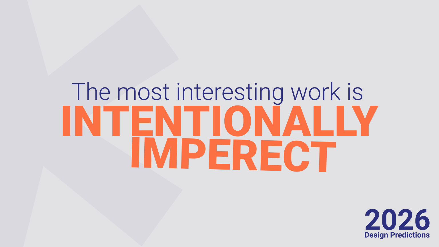
1. Imperfection is back and it’s doing real work
We noticed that designers are deliberately moving away from the frictionless, hyper-polished aesthetic that dominated the last few years, toward texture, grain, hand-drawn marks, analog artifacts, things that feel like they were made by hand.
When technical perfection became the default, it stopped meaning anything. Craft became the differentiator. The slight imperfection in a letterform, the visible texture in a layout, the collaged element that breaks the grid, these things signal intention in a way that perfect execution just doesn’t anymore.
In internal communications, this usually shows up in tone. When we over-edit in the name of “professionalism,” we tend to sand off the clarity and personality that actually make a message land. The updates that resonate are the ones that sound like a real person wrote them, even if they’re not perfectly polished. People can tell when something feels processed instead of genuinely authored, and that distance doesn’t build trust.
2. Expressive typography is doing the heavy lifting
Type in 2026 is being used for feeling. Stretched letterforms, layered type, arrangements that function more like visuals than words on a page. The best brand work right now treats typography as the primary design element, which requires real decisions about what a word or phrase should feel like, not just what it says. The difference between thoughtful and chaotic is entirely in the execution.
Most organizations default to whatever typeface came with the template, and honestly that’s a missed opportunity. Type sets tone more than almost any other design element, and even small adjustments in weight, scale, or spacing can change how a message feels before it’s read.
3. Mixed media is replacing the single-format aesthetic
The cleanest brand work in 2026 is, paradoxically, kind of messy. 2D illustration sitting next to 3D renders, photography layered with hand-drawn elements, all in the same frame, actually working together. What makes it cohesive is a strong underlying logic; a color palette, a typographic sensibility, a consistent tone running through everything. Without that thread it falls apart. With it, it feels alive.
Internal design systems are heading the same direction, away from rigid templates and toward flexible frameworks that can adapt to different communication needs while still feeling like they belong to the same organization.
4. Restraint is the flex
After years of everything competing for attention at maximum volume, the work that’s genuinely turning heads right now is restrained. Clean type, deliberate breathing room, clear hierarchy, colors that aren’t fighting each other. Considered, not boring, and there’s a real difference.
In an environment saturated with content, design that feels unhurried is quietly signaling something: that someone thought about what you actually need rather than just filling space. Calm has become a credibility marker. The update that’s focused and clear lands so differently than the one trying to do twelve things at once. People feel it even when they can’t explain why.
5. Spatial UI is changing how interfaces communicate
Depth, layering, and scale are starting to replace flat layouts as the primary way interfaces communicate hierarchy. Just like in a physical space, foreground and background help you understand where you are and what matters most. When that’s paired with subtle motion (a panel sliding in, a button responding, a confirmation appearing exactly where you expect it) the experience feels intuitive without adding complexity.
For employee-facing tools, this matters more than most people realize. When an interface clearly communicates hierarchy through its spatial logic, it reduces that subtle stress of not knowing where you are or what to do next. The clarity is quiet, but it makes the entire experience feel more steady and manageable.
6. Nostalgia and futurism are merging and it works
The most culturally resonant work right now isn’t picking a side between retro and modern. It’s doing both simultaneously. 70s color palettes with digital textures. Old patterns with contemporary motion. Vintage type sensibilities with spatial UI logic. The result feels familiar enough to trust and fresh enough to actually pay attention to.
7. Modular systems are replacing rigid brand identities
The old model of brand, fixed logo, fixed palette, fixed rules, is giving way to something more flexible. Modular systems that adapt across contexts and formats while maintaining a consistent underlying personality. The real challenge is building something that can stretch without losing itself, which is exactly the challenge internal systems face too.
Pulling it together
The thread running through everything interesting in design right now is consistent: a move toward the personal, the considered, and the real. Imperfection over polish. Clarity over comprehensiveness. Personality over neutrality.
That belongs in internal communications too, because the experience employees have every day is directly upstream of the experience customers have. You can’t design something that feels human on the outside when the inside feels generic and unconsidered.
It’s probably worth looking at your last few internal communications with this lens. Not to overhaul everything, but to notice. Do they feel intentional? Does the hierarchy make sense immediately? Does the tone sound like someone actually wrote it, or like it was processed into neutrality? Small shifts in those areas change how things land more than a full rebrand ever will.
The good news is none of this requires a massive overhaul. It mostly just requires paying attention to how things feel and being willing to make more deliberate choices. That’s what good design has always been about.